CAMINO Surfcamps
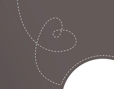
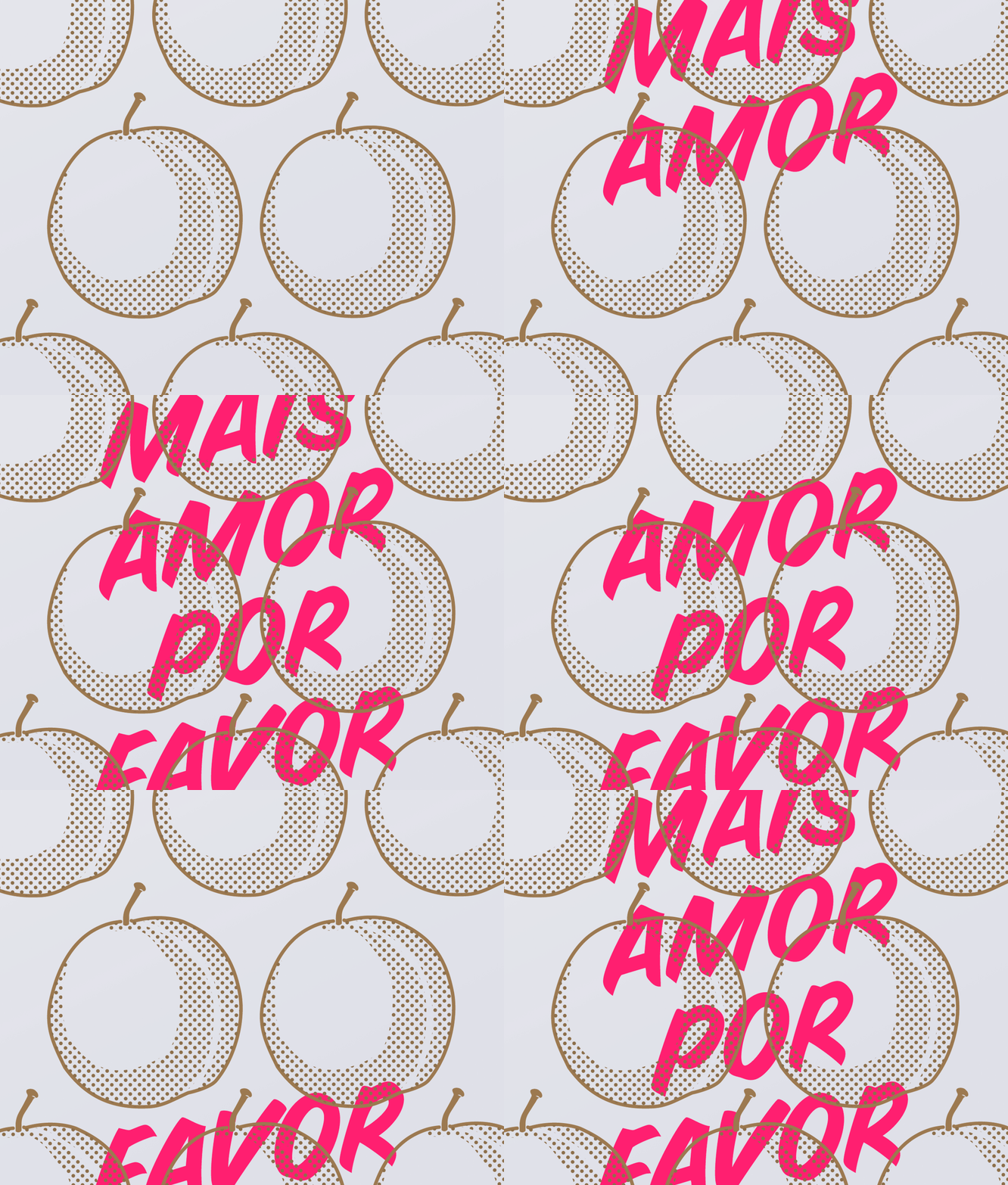
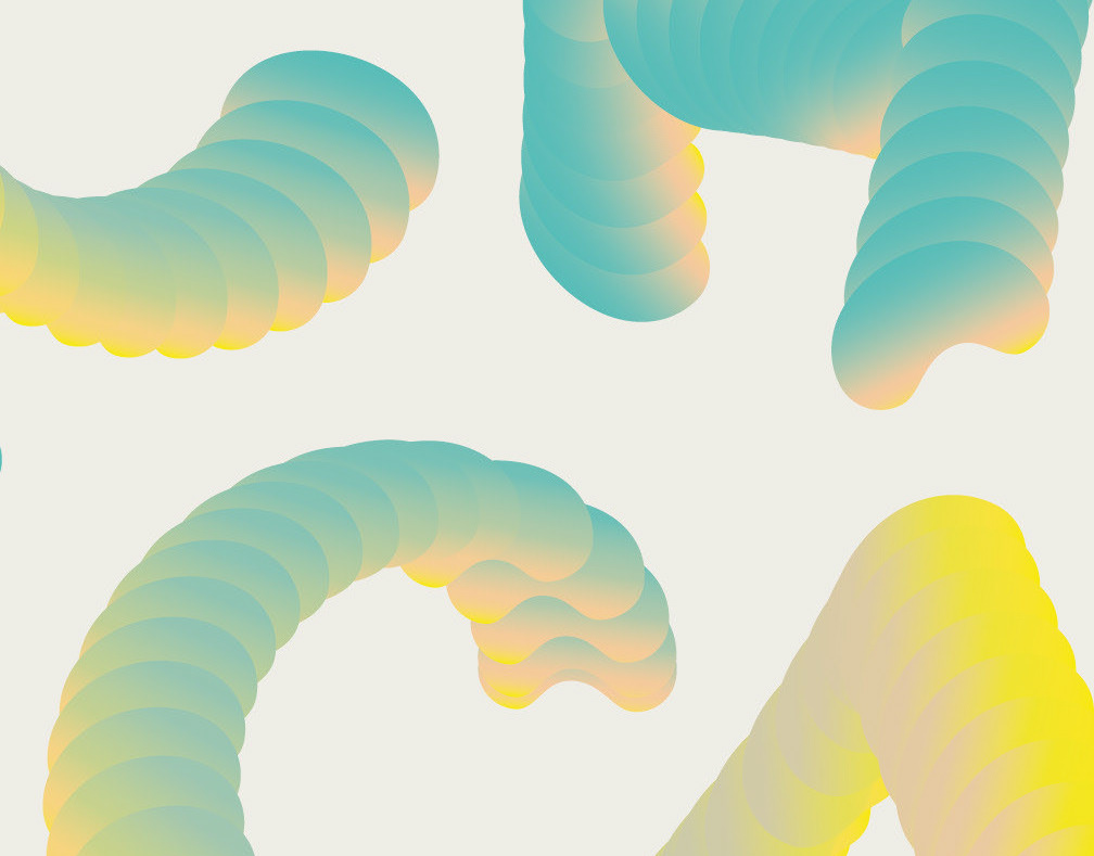
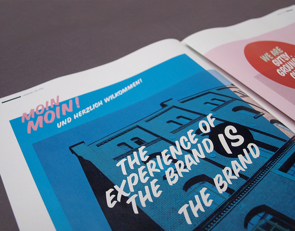
After visiting the Camino surfcamps I used my personal experience as inspiration to refresh the branding in all print materials. A mix of bright and intense colors show the most significant impressions: A family like warmth that I felt in the camp, blue ocean deepness, warm sandy beach color, but also influences like red spicy moroccan food taste. Staggered shapes adapted from the diagonal of the two triangle logo bring dynamic speed into the broshure.
Branding Refreshment, Graphic Design
